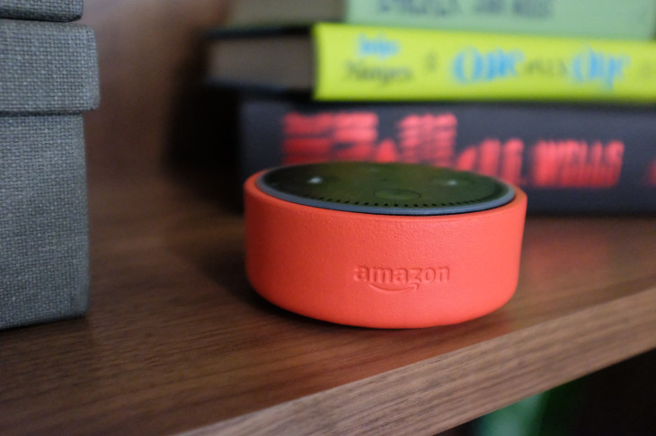
Hands On with the Eco Dot Kids Edition
Earlier this year, Amazon introduced an Echo Dot for kids, with its $80 Echo Dot Kids Edition device, which comes in your choice of a red, blue, or green protective case. The idea is to market a version of Amazon’s existing Dot hardware to families by bundling it with an existing subscription service, and by throwing in a few extra features …
Apple Rebuilds Maps from the Ground Up
I’m not sure if you’re aware, but the launch of Apple Maps went poorly. After a rough first impression, an apology from the CEO, several years of patching holes with data partnerships and some glimmers of light with long-awaited transit directions and improvements in business, parking and place data, Apple Maps is still not where it needs to be to be considered a world-class service. …
Microcopy for Destructive Actions
As designers, there are a variety of interface elements that fall under our purview. Whether you’re browsing fonts from a hot new Swiss type foundry or polishing the velvety drop shadows on your interface cards, it’s easy to get distracted. But there’s a tiny, impactful, part of the user experience that often gets neglected: microcopy. Microcopy …
How Culture Shapes Design at Pinterest and Shopify
Each company has its own unique corporate culture that influences the different departments in the organization. An organization’s culture has a major impact on the role of design in particular. A company that embraces innovation, creativity, and transparency creates an environment where design can thrive. InVision’s Director of Design Education Eli Woolery recently hosted a Fireside Chat with Pinterest’s …
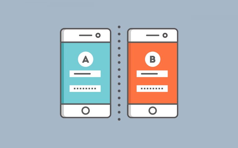
Let Go of the A/B Test
The humble A/B test is a prolific, important weapon in a design team’s toolkit. But it isn’t the only one. All too often we get comfortable in familiarity. But there are reasons why it pays to go beyond A/B testing, and not just for variety’s sake. Here’s the dirty little secret: Sometimes it might not even …
7 of Our Favorite World Cup Logos
Whether you’re rooting for Messi or Ronaldo, Germany or Holland, the World Cup brings us all together to celebrate the shared love of the game. There’s beer, cheers, and tears, and then just like that, it’s over—leaving us all to wait another four years to relive the excitement. World Cup logos have evolved to try …
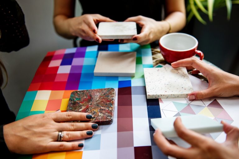
A Quick Guide to Choosing a Color Palette
Our job as designers is to take a product or project and make it user-friendly while remaining true to business goals. This is no small task. We’re responsible for everything from wireframes and user flows to typography and color selection. It doesn’t have to be overwhelming. With a few well-placed tips and hints, you can …
The Right Way to Use Humor in Your Microcopy
A common misconception about microcopy is that if we want to sound human, being funny will automatically do the trick. This approach, along with the current awareness to the importance of microcopy, has brought up quite a few cases of “trying too hard” microcopy, where it feels like the writers were trying so hard to be …


Recent comments